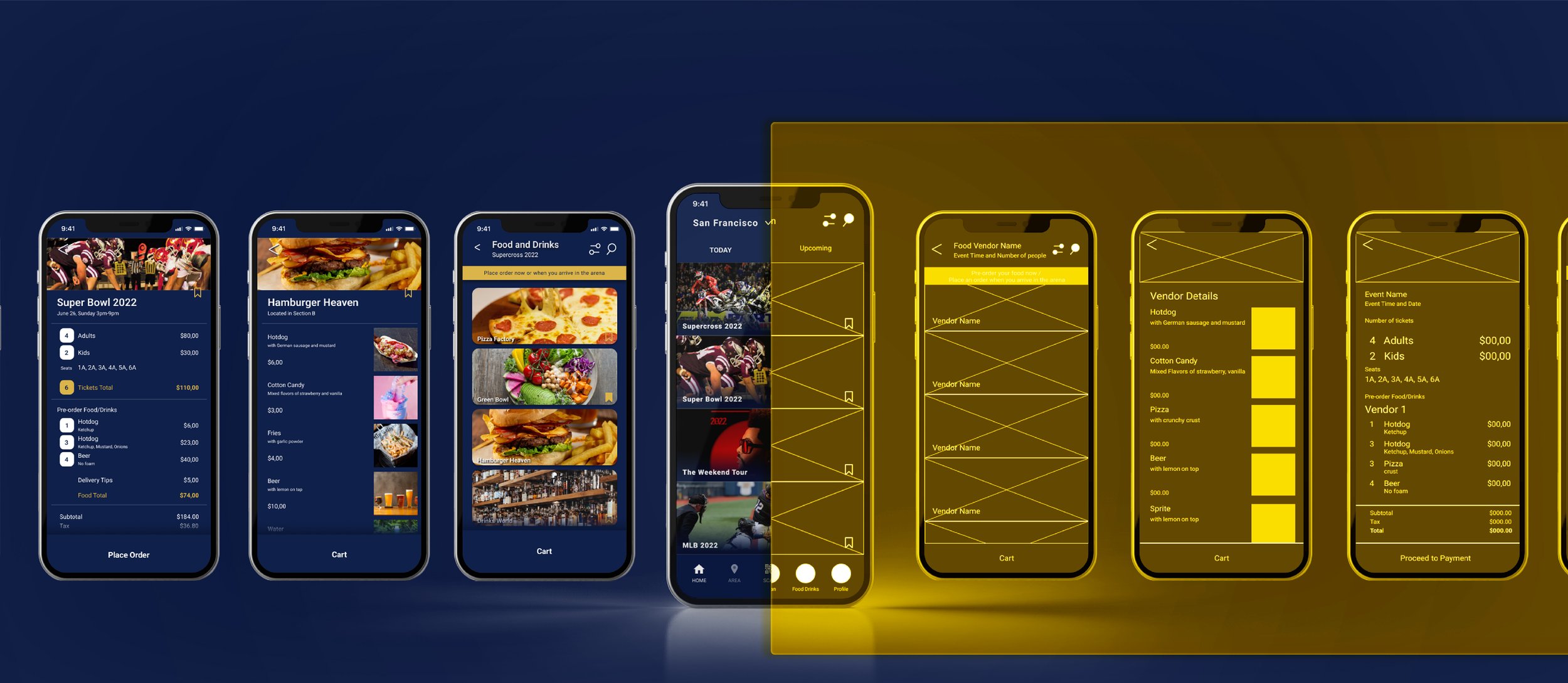
Motivated by my own dissatisfying experiences at stadiums, I came up with a personal project to understand shared pain points for attendees in sports arenas and design a solution for an improved experience.
Role
Entrepreneurial Project
Project Lead
Duration
3 Months (2020)
Team
Vivian Yu
(Solo)
Tools
Google Sheet
Tableau
Sketch/Figma
/ Problem
Ordering food at arena events is an ordeal that requires lining up in front of vendors, which often leads to attendees missing key moments of the event itself.
How might we improve this experience?
/ Solution
Design a better experience for ordering food and getting it delivered to people right in their seats. A secondary challenge is to persuade arena owners to adopt this strategy to increase ticket sales and improve customer experience.
/ User Research
First, I joined some Facebook groups where people sell arena and stadium tickets, and I created Google Form for people to fill out. Secondly, I re-visited the Oakland Coliseum and conducted interviews, and created empathy maps to understand the users I’m designing for and their needs. The reason I need to do this is that I need to know if there’s a market need for creating this app.
/ Findings
A primary user group identified through research was working adults who like to spend time in the arenas with friends and family. Research also revealed that time was not the only pain point in the food ordering process in arenas — it can also get unbearably cold or hot in outdoor arenas. Additionally, some people expressed feeling too lazy to move from their seats just to get food. 83% of people have expressed an interest in an app where they could order food to their seats.
| Pain Point - Time
“Waiting in line for food is not easy when it is so cold..”
| Pain Point - Convenience
“The delivery guy never brings the food I actually want, and sometimes when I do buy them it’s already cold.”
| Pain Point - Safety
“Lining up can get crowded and it’s just dangerous during a pandemic”
/ Who’s the TA?
Douglas
Age: 39 | Job: Dentist | Family of 3 Location: SF
/ Journey Map
Douglas is a new dad who likes to go to the arena with his family where they can spend quality time together as a family on weekends. He doesn't want to spend half of the time in the arena running around what vendor the arena offers and line up and wait for the food and being away for so long from his family and friends.
"If only I could just make an app and manage everything on my phone and I can either pick it up or if someone can pick it up for me and bring it over that would be great!”
Mapping Douglas' journey and flow revealed how helpful it would be for people to order food/drinks and browse for food/drinks options on the app.
Goal - Spend more time with family and be free from stress in the arena
/ Ideation
Drafting iterations of each screen on paper ensured that the elements that made it to digital wireframes would be well-suited to address user pain points. For the home screen, I prioritized a quick and easy ordering process to help people save time.
/ Usability Findings
I conducted two rounds of usability studies. Findings from the first study helped guide the designs from wireframes to mockups. The second study used a high-fidelity prototype and revealed what aspects of the mockups needed refining.
| Pain Points
People don’t know where to grab their food order
Worry food is going to get cold
| Needs
People want to have Apple Pay option
In-seat delivery option
/ Color & Font
Color choice was based on the survey conducted during the first usability study.

From Low Fidelity to High Fidelity
/ Iteration
Home Screens
Early designs A had big logos on the top but after usability studies, I removed the logo to the right bottom corner to indicate the profile page. By changing the fonts to bolder text B, users have shown it is clearer to navigate. Instead of adding a bar C to insert location, will simply replace it with the user’s current location. Users could find events 17 seconds faster when the system auto-filled the user’s current location.
/ Iteration
Food Option Screens
Through usability studies, I was able to identify some of the pain points our participants were facing. Users found the information unclear in designs A and C because they had expanded images. Users found it easier to navigate design B (which came from iterating based on their feedback for A and C)
/ Accessibility
Provided access to users who are visually impaired by adding alt text to images for screen readers
Provided more instructions on wheelchair accessibility and the fastest way to pick up the order
Used more imagery on food toppings and food customizations
The moment I realized this app is much needed


